
A website’s design is its handshake with the world. It creates that crucial first impression. A cluttered, confusing layout makes visitors leave instantly. A clean, intuitive, and attractive design makes them stay and explore. Good design blends aesthetics with function. It is not just about looking pretty. It is about guiding the user effortlessly to their goal. This process starts from the very top. The website header creation is the cornerstone of this entire experience. It is the first element people see and use for navigation.
This initial section sets the stage for the entire user journey. A well-executed website header creation establishes brand identity and provides essential tools. It combines logo placement, navigation menus, and vital calls to action. Ignoring its design can sink an otherwise good site. This article provides practical advice for building an effective layout. It will cover core principles, technical CSS tips, and modern design examples. The goal is to offer actionable knowledge for creating interfaces that both look great and work perfectly. To make this guide even more practical, a detailed PDF manual with step-by-step instructions is available for download at the end of the article.
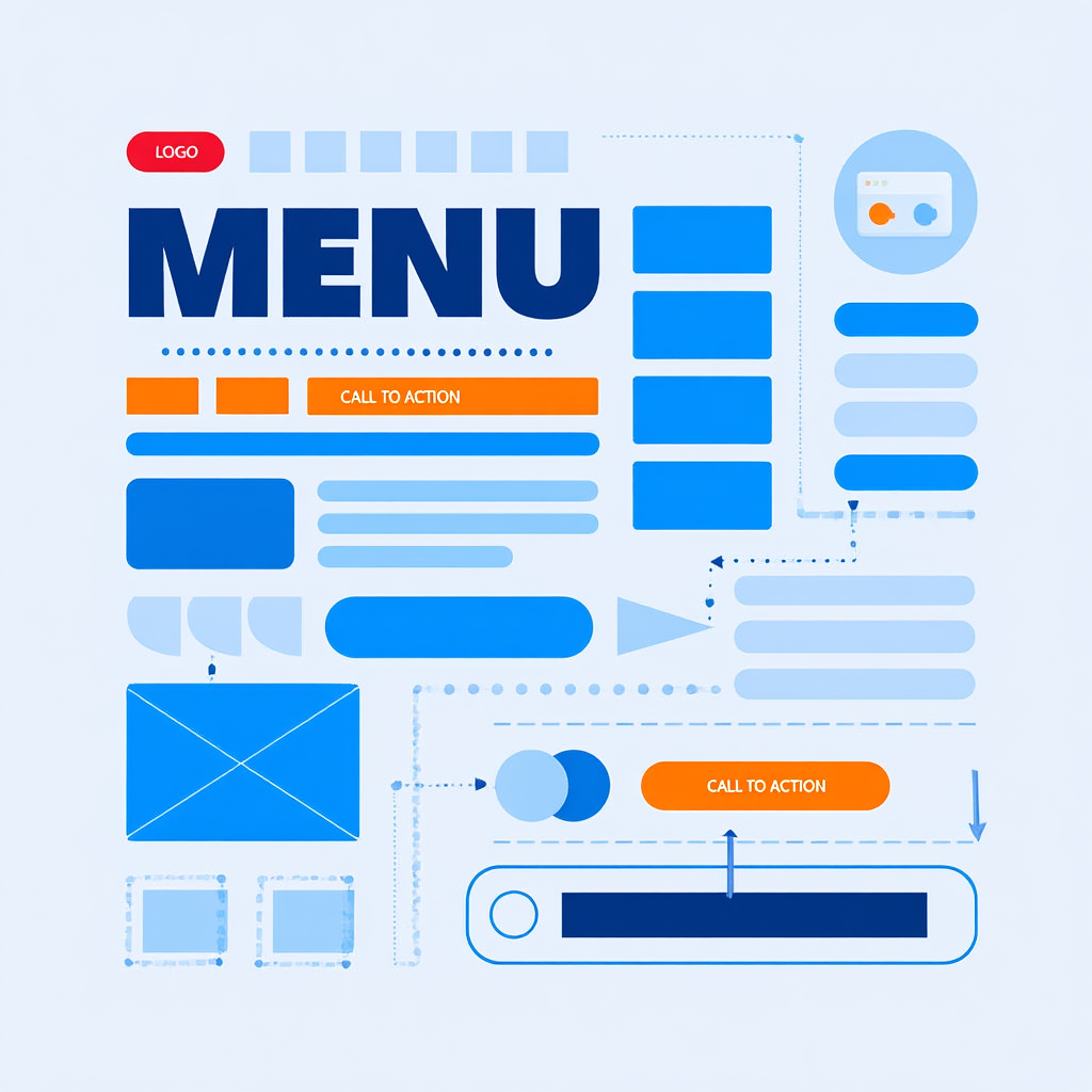
Interface Elements: Buttons, Menus, Structure
A site’s interface is built from fundamental components. These parts must work together in harmony. Buttons, menus, and a clear structural hierarchy guide the user. Each element has a specific job. Their design directly influences how people interact with the content. Confusing menus lead to frustration. Unclear buttons result in missed conversions. Every choice must be intentional and user-centric.
Limit primary navigation to 5–7 items. This reduces cognitive load and helps users make decisions faster.
Crafting Intuitive Navigation Menus
Navigation is the roadmap of a website. Users rely on it to find what they need quickly. A successful menu system is simple, predictable, and consistent. Place primary menus in expected locations. The top of the page or a hamburger menu on mobile are standard. A study by the Nielsen Norman Group (2010, USA) found that users spend 80% of their time looking at information above the page fold, making header navigation critical. Limit the number of main menu items to around seven. Too many options overwhelm visitors. Use clear, descriptive labels for each link. Avoid clever or vague jargon that confuses people.
Dropdown menus can organize subcategories effectively. Ensure they are easy to trigger and remain open. The user should not struggle to keep a dropdown visible. Mobile navigation requires special attention. Hamburger menus are widely understood but consider priority. Sometimes, key links are better placed in a visible bottom bar. Test different layouts with real users. Their feedback reveals navigation pain points instantly.
The Power of Effective Call-to-Action Buttons
Buttons tell users what to do next. Their design can dramatically impact conversion rates. Beautiful buttons for a website stand out from surrounding content. They use color, size, and whitespace to draw attention. A button’s label must be action-oriented. Use strong verbs like “Get,” “Start,” or “Download.” The message should be clear and create a sense of value.
Micro-interactions add a layer of polish. A subtle color change or slight animation on hover provides feedback. This tells the user the element is interactive. It makes the experience feel responsive and modern.
“Don’t make me think! It should be self-evident. Obvious.” — Steve Krug, usability consultant
Always ensure buttons have a sufficient size. They must be easy to tap on touchscreens without zooming. Padding inside the button is crucial for readability and clickability. Additionally, ensure buttons meet WCAG standards by providing sufficient color contrast (at least 4.5:1) and ARIA labels for screen readers, making your site inclusive for all users.
Establishing a Clear Visual Hierarchy
Content needs structure. Not all information holds equal importance. Visual hierarchy guides the user’s eye through a page. It shows them what matters most. Size is a powerful tool. Larger elements grab attention before smaller ones. Color and contrast can highlight key messages or important beautiful buttons for a website.
Whitespace is not empty space. It is a critical design element. It prevents clutter and gives content room to breathe. Group related items close together. This creates relationships between elements without using lines. Alignment creates order and makes a layout look professional. A clear hierarchy reduces cognitive load. Users can process information faster and with less effort.
Good design is obvious. Great design is transparent.” — Joe Sparano, graphic designer and educator.
Colors, Spacing, Blocks: Key CSS Properties
The visual magic of a website happens with code. CSS properties control layout, color, and spacing. Mastering these tools is essential for good design. They transform a basic HTML structure into a polished experience. Consistent use of these properties creates a cohesive look. Inconsistent use makes a site feel messy and unprofessional.
Building a Cohesive Color Palette
Colors evoke emotion and reinforce brand identity. A good palette uses a primary color, secondary colors, and neutrals. The primary color should be used sparingly for accents. Use it for headlines, icons, and those beautiful buttons for a website. Secondary colors complement the main hue and provide variety.
Always check contrast ratios between text and its background. Low contrast text is difficult to read and inaccessible. Tools like WebAIM’s Contrast Checker can verify this. Neutrals like gray, white, and black form the foundation. They are perfect for backgrounds and large text areas. A limited, consistent palette looks more professional than using many colors.
Mastering Spacing with Padding and Margin
Whitespace is created with the padding and margin properties. Padding is the space inside an element, between its content and its border. Margin is the space outside an element, separating it from other components. Consistent spacing creates rhythm and improves readability.
- Define a spacing scale (e.g., 4px, 8px, 16px, 24px, 32px, 64px).
- Use these values consistently for all padding and margin.
- This creates visual harmony and makes the code easier to maintain.
- Avoid arbitrary values like 7px or 13px which disrupt consistency.
Controlling Layouts with Block Properties
The height and width properties define an element’s size. Controlling a block’s height in CSS is common for creating hero sections. Using min-height can be more flexible than a fixed height value. It allows the container to grow if its content expands. This prevents content from accidentally overflowing its container.
A responsive website background is non-negotiable in modern design. Use background-size: cover; for image backgrounds. This property scales the image to cover the entire element’s area. It ensures the background looks good on all screen sizes.
A Stanford study found that 75% of users judge a company’s credibility based on its website design. (2002, Stanford University).
For patterns or precise control, background-size: contain; might be better. It scales the image to be as large as possible without cropping.
Using div for Layout
The <div> element is the universal container of the web. It groups content into sections for styling and layout. Modern div based layout relies on Flexbox and CSS Grid. These systems provide powerful tools for creating complex designs. They have replaced older methods like using HTML tables for structure.
Use CSS Grid for overall page layout and Flexbox for aligning content within components. They work best together.
Flexbox for One-Dimensional Layouts
Flexbox excels at arranging items in a row or a column. It is perfect for components like a navigation bar. A parent container becomes a flex container with display: flex;. Its direct children then become flex items. These items can be aligned, justified, and ordered with simple properties.
Use justify-content to control spacing along the main axis. Use align-items to control spacing on the cross axis. This allows for easy centering of both elements and text. Flexbox is ideal for the website header creation process. It can horizontally align a logo, navigation links, and a button.
Use this template as a starting point for your header:
text
<!-- HTML Template -->
<header class="site-header">
  <div class="logo">Your Logo</div>
  <nav class="nav-menu">
    <ul>
      <li><a href="#">Home</a></li>
      <li><a href="#">About</a></li>
      <li><a href="#">Contact</a></li>
    </ul>
  </nav>
  <button class="cta-button">Sign Up</button>
</header>

/* CSS Template */
.site-header {
  display: flex;
  justify-content: space-between;
  align-items: center;
  padding: 1rem;
  background-color: #f8f9fa;
}
.nav-menu ul {
  display: flex;
  list-style: none;
  margin: 0;
  padding: 0;
}
.nav-menu li {
  margin: 0 1rem;
}
.cta-button {
  padding: 0.5rem 1rem;
  background-color: #007bff;
  color: white;
  border: none;
  border-radius: 4px;
}
@media (max-width: 768px) {
  .site-header {
    flex-direction: column;
  }
}
CSS Grid for Two-Dimensional Layouts
CSS Grid is for layout in both rows and columns simultaneously. It is the best tool for overall page structure. Define a grid container with display: grid;. Then use properties like grid-template-columns to define the tracks. Items can be placed into specific areas of this defined grid.
This method offers precise control over the entire page layout. It simplifies the process of creating responsive designs. Media queries can change the grid structure on different screen sizes. A strong div based layout strategy often combines both Grid and Flexbox. Use Grid for the large-scale page structure. Use Flexbox for the smaller components within each grid area.
| Feature | Flexbox | CSS Grid |
|---|---|---|
| Dimension | One-dimensional (row OR column) | Two-dimensional (rows AND columns) |
| Best For | Components, aligning content | Overall page layout, complex sections |
| Use Case | Navigation bars, card groups, centering | Defining main areas (header, main, sidebar) |
The Role of Semantic HTML
While <div> is incredibly useful, do not overuse it. HTML5 provides semantic elements that are more descriptive. Tags like <header>, <nav>, <main>, and <footer> replace generic divs. They improve accessibility and search engine optimization.
Screen readers can better understand the page structure. Search engines can better identify important content. A modern approach uses semantic elements as the main containers. Div based layout techniques are then used inside these elements for styling. This combines the best of both structure and presentation. For those just starting out with these core structural concepts, a guide on building a website from the ground up can provide invaluable context.

Examples of Beautiful Solutions
Seeing theory in action is the best way to learn. Many modern design trends are both attractive and functional. They solve common problems with elegant solutions. These examples can serve as inspiration for your own projects. They show how color, spacing, and layout come together.
Modern Header Design Inspirations
A contemporary website header creation often uses a minimalist approach. A simple logo on the left with navigation links on the right is classic. A prominent “Sign Up” button in a contrasting color draws the eye. Some sites use a sticky header that remains visible as the user scrolls. This provides constant access to navigation.
Another popular trend is the hero section with a full-screen background. This responsive website background image is paired with bold text. A clear call-to-action button sits centered over the image. Overlays can improve text readability on busy images. A dark or colored overlay with reduced opacity makes white text pop.
Creating a Responsive Hero Section: A Step-by-Step Guide
Building a flexible hero section involves several key steps. This process ensures the section looks great on any device.
- Structure the HTML using a semantic
<section>tag with a class. Place elements like a heading, paragraph, and button inside a container<div>. - Apply critical CSS styles. Set the section’s height in CSS to
100vhfor a full-viewport effect. Usebackground-imageto add the responsive website background. Crucially, setbackground-size: coverandbackground-position: center. - Style the text and button for clarity and impact. Use a text shadow or semi-transparent overlay to ensure readability. Position the content container using Flexbox for perfect centering.
- Add media queries to adjust styles on smaller screens. Reduce the font-size of headings and change the block’s height in CSS to
autoif needed.
Card-Based Layouts for Content
Cards are containers that group related information together. They are a cornerstone of modern div based layout for content. Each card acts as a distinct piece of content, like an article preview. They typically include an image, a title, a short description, and a link.
This design pattern is highly flexible and responsive. Cards can reflow into different columns based on screen width. They create a clean, organized presentation of multiple items. E-commerce sites, blogs, and dashboards use cards extensively. They break information into digestible chunks for the user.
Engaging and Interactive Buttons
Beyond basic rectangles, buttons have evolved. Rounded corners with a border-radius property feel more friendly and modern. Ghost buttons (transparent with a border) are great for secondary actions. They have a lighter visual weight than solidly filled buttons.
Adding a simple CSS transition on hover makes a button feel alive. A smooth color change or a slight upward movement on hover is effective. This micro-interaction provides delightful feedback.
“Animation can help users understand the relationships between elements, and how the interface is responding to their actions.” — Val Head, design advocate, author of “The Pocket Guide to CSS Animations”, and speaker on web animation.
It confirms the user’s action before they even click. These details elevate good beautiful buttons for a website to great ones.
Use min-height instead of height for content blocks. This prevents awkward overflow issues and makes layouts more resilient.
Handling Height in Dynamic Layouts
Dealing with a block’s height in CSS can be tricky with dynamic content. The min-height property is a developer’s best friend. It sets a minimum value but allows the element to grow taller. This prevents content from being cut off if text is longer than expected.
A Baymard Institute study (2021, Denmark) highlighted that poor mobile layout choices, including incorrect element sizing, are a primary cause of high cart abandonment rates.
For a full-screen hero section, use height: 100vh;. This unit makes the element exactly as tall as the viewer’s screen. For a responsive website background within a section, ensure the container has a defined height or min-height. Then set the background image to cover to handle scaling across devices. Once your layout is set, optimizing front-end performance ensures a smooth user experience across devices.
FAQ
How many items should be in a website header?
Keep the main navigation items between five and seven. This is a manageable number for users to process quickly. Too many options create paradoxically less choice. Group less important links in a footer or secondary menu. The goal for any website header creation is clarity and speed.
Why is whitespace so important in design?
Whitespace reduces cognitive overload. It gives the user’s eye a place to rest. It helps separate and define groups of information. Crowded content is difficult to read and navigate. Generous spacing feels modern, clean, and premium.
What is the best way to make a background image responsive?
The best method is to use the CSS declaration background-size: cover;. This will scale the image to cover the entire container. It will crop the image as needed to maintain this coverage. Always set a background color as a fallback. This ensures text remains readable if the image fails to load.
Should I use Flexbox or CSS Grid?
Use CSS Grid for the large-scale layout of your page. It defines the main areas like header, main, sidebar, and footer. Use Flexbox for the smaller components within those areas. For example, use Grid to define the page structure. Then use Flexbox to align the items inside the website header creation. They are complementary technologies.
How can I ensure my color choices are accessible?
Use online tools to check contrast ratios. The Web Content Accessibility Guidelines (WCAG) require a minimum ratio. This is 4.5:1 for normal text and 3:1 for large text. Many free tools can analyze your color combinations. They will instantly tell you if they pass accessibility standards.
Before wrapping up, here’s a short video with six smart tips on website header creation. It shows real examples and makes the process easier to understand.
Conclusion
A great website design is a balance of form and function. It requires attention to foundational elements like a strong website header creation. It demands mastery of CSS properties to control layout and spacing. Techniques like div based layout with Flexbox and Grid are essential. The goal is always to serve the user. Every choice, from beautiful buttons for a website to a responsive website background, must make their journey easier.
The principles outlined here provide a strong foundation. Start by sketching a layout. Then, build it with clean HTML and powerful CSS. Test your designs on different devices and with real people. Their experience is the ultimate measure of success. Good design is not a mystery. It is a process of thoughtful creation and iteration. Begin applying these tips today to build more effective and engaging websites. For readers who want to keep these strategies at hand, the complete step-by-step manual is available as a downloadable PDF file right below.

Sources
- 2010, Nielsen Norman Group. Scrolling and Attention.
- 2002, Stanford University. Stanford Web Credibility Research.
- 2021, Baymard Institute. Cart Abandonment Rate Statistics.
- Steve Krug, 2000, Don’t Make Me Think. Don’t Make Me Think.
- Val Head, 2016, The Pocket Guide to CSS Animations. The Pocket Guide to CSS Animations.
- Joe Sparano, undated, Graphic Design Quote. Joe Sparano Portfolio.
- Miller’s Law (5-7 items), 1956, George Miller. The Magical Number Seven, Plus or Minus Two.