Updated 1/2026
A website’s structure is its backbone. It dictates how information is organized and connected. This framework guides visitors and search engines through the content. A logical layout makes a site intuitive to use. A confusing one drives people away. Understanding website architecture is crucial for success online. It impacts user experience and search engine visibility equally. Getting it right from the start saves enormous effort later.
This foundation is not just about menus and links. It involves planning the hierarchy of all pages. A strong website structure helps users find information quickly. It also allows search engines to index content effectively. Think of it as the blueprint for a building. Without a solid plan, the entire project can collapse. Investing time in this planning phase pays long-term dividends. To make this guide even more practical, a step-by-step website structure checklist is included at the end.

How to Create a Logical Structure
A logical website structure feels natural to the visitor. It groups related topics together in a clear hierarchy. This organization starts with broad categories and drills down to specific details. The goal is to make the journey from homepage to any page simple. Users should never feel lost or confused about where to go next. This clarity keeps them engaged and reduces frustration.
Start with a Content Inventory
Before sketching anything, list all existing and planned content. This includes pages, blog posts, products, and tools. Group these items into common themes or topics. These groups will form the primary sections of the website. This exercise reveals the natural categories of the business. It prevents forcing content into ill-fitting sections. A content inventory is the essential first step.
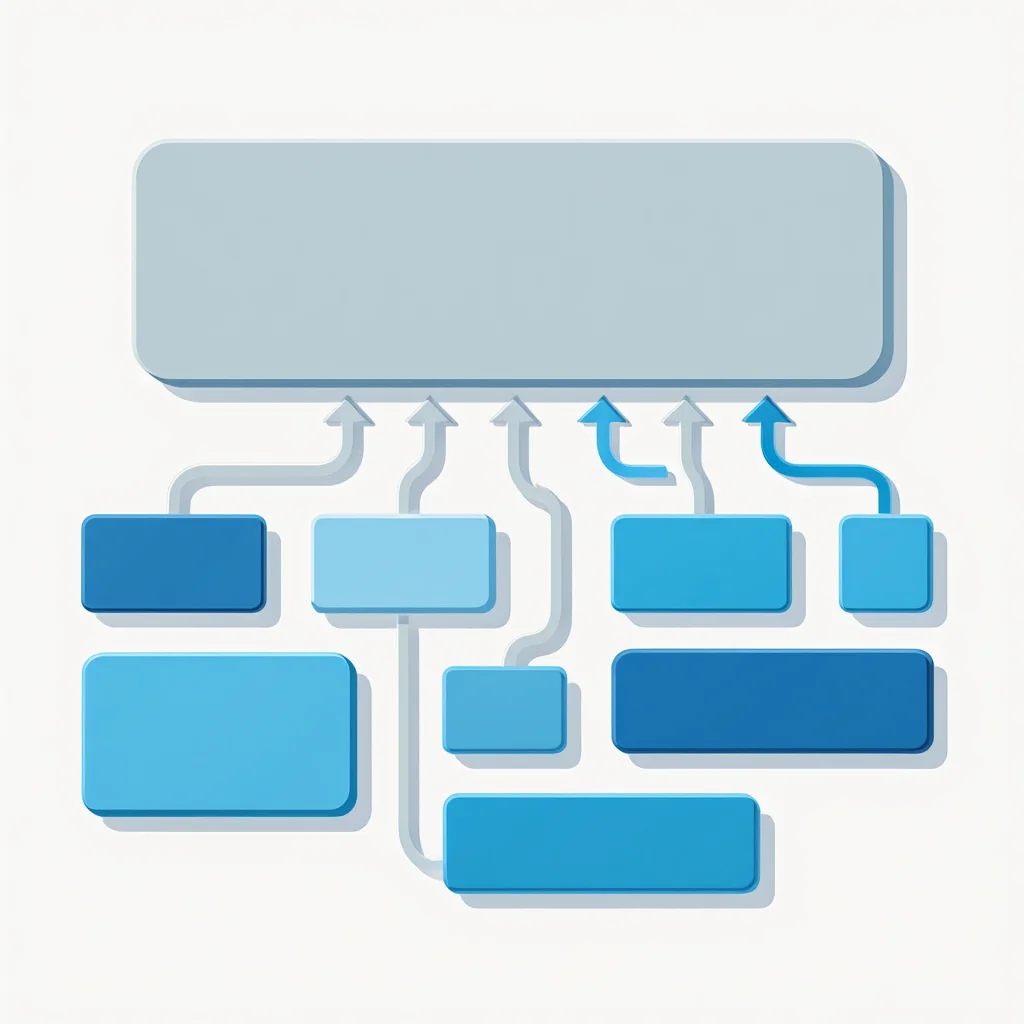
Embrace the “Hub and Spoke” Model
This model centers on pillar pages that cover a broad topic. Smaller, related articles then link back to this main hub. This creates a tight network of information. For a kitchenware brand, a “Knives” pillar page would connect to articles about sharpening or types of steel. This structure is excellent for SEO and user learning. According to a study by HubSpot, companies using topic clusters experienced up to 55% more page views and reduced bounce rates. (2020, HubSpot). It establishes the site as a comprehensive authority on the subject.
“Topic clusters help organize content around core themes, improving user engagement and SEO signals.” Said by Neil Patel, Co-founder of NP Digital, a leading SEO expert and marketer.
Here’s a simple diagram illustrating the Hub and Spoke model:

Keep the Hierarchy Flat
Aim for a shallow website structure where pages are close to the root. Ideally, users should reach any content within three clicks from the homepage. Deep hierarchies, with pages buried many levels down, are hard to navigate. They also make it difficult for search engine crawlers to find content. A flat architecture is more efficient for everyone. It simplifies the entire user pathway.
How many layers should a site have? Most small-to-medium sites thrive with three or four levels. The domain itself is the first level. Main sections like /services/ form the second. Individual service pages create the third. This shallow approach forms a robust and crawlable website foundation.
| Level | Example | Description |
|---|---|---|
| 1: Root | example.com | Homepage |
| 2: Main Sections | example.com/services/ | Broad categories like Services |
| 3: Sub-Pages | example.com/services/plumbing/ | Specific services |
| 4: Details (if needed) | example.com/services/plumbing/tips/ | In-depth content, but avoid deeper |
 The Three-Click Rule
Users should be able to access the information they need from the homepage in three clicks or fewer. This promotes a flat, user-centric hierarchy.

Main Menu: What to Include
The main menu is the most prominent navigation tool on a site. It provides the primary map for the entire website. A well-designed menu directs users to key destinations instantly. It should reflect the most important user goals and business objectives. Cluttering it with every single page option creates paralysis. Strategic choices are necessary for an effective website menu.
Prioritize User Goals
The website menu must serve the people visiting it. Identify what they most want to accomplish. Common goals include finding contact information, seeing a portfolio, or checking prices. The main navigation should offer clear paths to these destinations. Business goals are important, but they should align with user intent. Forcing irrelevant items into the main menu hurts usability.
Limit Top-Level Options
Human memory has limits. A menu with too many choices overwhelms visitors. A good rule is to keep top-level items between five and seven. This forces a focus on what truly matters.
“Primary navigation should be a clear path to core content, not a dump of every link.” Said by Steve Krug, UX expert and author of “Don’t Make Me Think”.
If more sections are needed, consider using a mega menu or footer navigation. A concise main menu appears cleaner and is easier to process. It enhances the overall clarity of the website structure.
Use Clear, Familiar Labels
Creativity can backfire in navigation. Use simple, common words that people instantly recognize. “Services” is better than “Solutions.” “Contact Us” is better than “Reach Out.” Avoid internal jargon that outsiders won’t understand. The label should accurately describe the content behind the link. Misleading labels erode trust and increase bounce rates. Clear language builds user confidence.
A dropdown can organize sub-pages under a main section. This keeps the primary navigation bar clean. It also previews the content available within that section, including interactive elements like galleries, forums, or forms. For a complex website structure, this is an essential tool.
Checklist for a Strong Main Menu
- Keep between 5–7 top-level links
- Use familiar, clear labels
- Avoid unnecessary clutter
- Provide dropdowns for grouped sub-pages

Subdomains, Folders, URLs — Everything Explained
The technical setup of a website structure matters greatly. It defines how content is stored and accessed. The root domain, like example.com, is the home address. Content can be organized in subfolders or on separate subdomains. This decision affects both user perception and SEO performance. A clean, logical URL structure is a sign of a professional site.
Subdomains vs. Subdirectories
A subdomain appears as blog.example.com, while a subfolder is example.com/blog. Search engines often treat subdomains as separate entities. This can dilute the ranking power of the main domain. For most content, a subfolder structure is preferable. It consolidates all authority under the primary root domain. Subdomains are better for entirely separate, large functions like an e-commerce store (shop.example.com).
Understanding the different levels of domains is key. The root domain is the top level. Subdomains and subdirectories create subsequent levels of domains. This hierarchy forms the technical website structure. Choosing the right level for each piece of content requires planning.
Crafting Readable URLs
A URL should clearly describe the page’s content. example.com/services/plumbing/ is perfect. example.com/page123?id=567 is not. Readable URLs are better for users and SEO. They act as their own anchor text when copied and shared. Keywords in the URL can provide a slight ranking benefit. Always strive for URLs that are simple and descriptive.
Comparison Table
| Structure Type | Example URL | Best For | SEO Consideration |
|---|---|---|---|
| Subdomain | blog.company.com | Large, distinct site sections (e.g., blogs, stores) | Treated more like a separate site; can split authority |
| Subdirectory | company.com/blog/ | Most content (services, products, articles) | Keeps all authority on the main domain; preferred for SEO |
| Root Domain | company.com/about | Core pages (Home, About, Contact) | The strongest pages for building authority |
Logical Folder Hierarchy
Group pages into folders that make sense. All blog posts should live in the /blog/ folder. All service pages should be in a /services/ folder. This creates a pattern that users and search engines recognize. It makes the website structure predictable and easy to expand. Adding a new service simply means adding a new page to the existing /services/ folder.
The Subdirectory Default
Unless you have a specific, compelling reason to use a subdomain (like a separate application), always place new content in a subdirectory of your main domain to consolidate SEO value.

Navigation Errors and How to Avoid Them
Common mistakes can cripple an otherwise good website. Navigation errors frustrate users and hinder conversions. They often stem from a lack of testing or internal bias. Seeing the site from a fresh perspective is vital. Avoiding these pitfalls ensures a smooth experience for all visitors. A clean navigation system supports a strong website structure.
The Hidden Navigation Trap
Some sites get creative and hide essential links. Burying important pages in a footer or obscure vertical menu is a error. Contact information or pricing should be easy to find. According to Baymard Institute research, 15% of cart abandonments occur due to unsatisfactory return policies, often hidden in navigation. (2025, Baymard Institute). If users must hunt for critical data, they will leave. Essential links deserve prominent placement. The website menu should provide direct access to key actions.
Inconsistent Menu Locations
The main menu should appear in the same place on every page. Typically, this is the header or top of a sidebar. Moving its location confuses visitors and breaks their browsing flow. Consistency builds comfort and allows for easy, habitual use. A stable menu is a cornerstone of reliable website navigation.
Ignoring Mobile Experience
Mobile design cannot be an afterthought. A seamless mobile experience is essential today, and one key way to achieve it is through proper handling of images that adapt to screen sizes. Navigation that works on desktop may fail on a small screen. Hamburger menus are a standard solution for mobile sites. The vertical menu that expands from this icon must be equally robust. Every item from the desktop view should be accessible.
“Consistency across devices builds trust; mobile navigation must match desktop expectations.” Said by Jakob Nielsen, Principal at Nielsen Norman Group, UX pioneer.
Checklist for Mobile Navigation
- Never use navigation that requires a hover to reveal options on mobile
- Ensure all buttons and links are large enough for a finger to tap
- Keep the mobile vertical menu concise and scannable
- Test the entire user journey on multiple devices
A website’s structure is not a “set it and forget it” element. It needs periodic review as the business grows and changes. Analytics can show where users get stuck or leave.
“Regular audits of information architecture ensure ongoing SEO success and user satisfaction.” Said by Rand Fishkin, Founder of Moz, SEO expert.
Regularly auditing and tweaking the architecture keeps the site effective. This ongoing process maintains a positive user experience over time.
The Quarterly Navigation Audit
Use analytics tools every three months to identify top exit pages and pages with low engagement. This data reveals where your website structure is failing users.

How to Audit Your Existing Site Structure
Feeling lost about where to begin with an existing site? A structured audit can illuminate problems and create a clear path forward. This process helps you understand the current state of your information architecture. Follow these steps to diagnose and improve your setup.
First, export a list of all your website’s URLs using a tool like Screaming Frog SEO Spider or your site’s Google Search Console. This gives you a complete picture of every page search engines see.
Step 1: Categorize Your Pages
Open your list of URLs and create a new spreadsheet. Group each page into broad categories like ‘Services’, ‘Blog’, ‘Products’, ‘About’, ‘Legal’, etc. This will instantly show you if your content is organized logically or scattered without a pattern.
Step 2: Analyze the Click-Depth
For each important page, note how many clicks it is from the homepage. Pages that require more than three clicks are buried too deep. Nielsen Norman Group research shows users often leave pages in 10-20 seconds if navigation is deep, leading to higher abandonment. (2011, Nielsen Norman Group). Flag these deep pages for restructuring.
Step 3: Map the Internal Linking
Use your crawling tool to see how pages interlink. Identify orphan pages that have no internal links pointing to them. These pages are invisible to your visitors and are poorly understood by search engines. Integrate them into your main website structure through relevant contextual links.
Step 4: Check for Consistency
Manually review your main menu, footer menu, and any vertical menu on key pages. Ensure they are consistent across the entire site. Inconsistency here is a major source of user confusion and a sign of a poorly planned architecture.
A proper audit highlights both strengths and weak spots of your website structure. It shows where users face friction, which pages need restructuring, and how internal links can be improved. With this process, a messy architecture can be turned into a clear, user-friendly system. Regular audits ensure the site adapts as content grows and business goals evolve, keeping navigation effective and user journeys smooth. A well-optimized site ensures fast loading times, which is crucial for retaining visitors during navigation.
Use this simple audit form to track your findings:
Page URL: _______________
Category: _______________
Click Depth: _______________ (from homepage)
Internal Links: _______________ (list)
Issues: _______________ (e.g., orphan page, inconsistency)
Recommended Fix: _______________
FAQ
How many items should be in my main menu?
Aim for five to seven top-level links. This number is manageable for most users to process quickly. If you have more content, use dropdown menus or mega menus to organize sub-pages. This keeps the primary navigation clean and focused.
What is better for SEO: subdomains or subfolders?
For most websites, subfolders (subdirectories) are the better choice. They keep all content on the main root domain, consolidating SEO value. Subdomains are useful for very large, functionally distinct sections like a separate blog platform or e-commerce store.
How does website structure affect SEO?
A logical website structure helps search engines crawl and index pages efficiently. It creates clear thematic clusters around topics. Internal linking within a good architecture distributes page authority throughout the site. This can lead to higher rankings for more pages.
What is the simplest way to improve my site’s navigation?
Add a clear “Contact” link to your website menu and ensure your page titles accurately reflect their content. Conduct user testing by asking someone unfamiliar with your site to find key information. Their struggles will instantly highlight problems.
Before the conclusion, it’s helpful to transition into a visual example. This video offers a concise and clear breakdown of website structure fundamentals—including architecture types and practical tips for choosing the right model. It perfectly complements the article and reinforces the content.
Conclusion
A smart website structure is the invisible engine of online success. It seamlessly guides visitors to their goal. It tells search engines what the site is about. Building this framework requires thoughtful planning and organization. The effort results in a site that is both user-friendly and search engine friendly. Start by auditing your content and defining your core categories. A solid foundation makes everything else easier.
Before wrapping up, don’t miss the free checklist prepared for you. It highlights every crucial step for building and auditing a website structure in an easy, interactive format. Use it as a quick tool to test your site or plan a new project.

Sources
- Research (2020, HubSpot). HubSpot State of Marketing Report. HubSpot State of Marketing Report
- Research (2025, Baymard Institute). Cart Abandonment Rate Statistics. Cart Abandonment Rate Statistics
- Research (2011, Nielsen Norman Group). How Long Do Users Stay on Web Pages? How Long Do Users Stay on Web Pages?
- Three-Click Rule (2019, Nielsen Norman Group). The 3-Click Rule for Navigation Is False. The 3-Click Rule for Navigation Is False
- 5-7 Menu Items (1956, George A. Miller). The Magical Number Seven, Plus or Minus Two. The Magical Number Seven, Plus or Minus Two
- Neil Patel, 2020, NeilPatel.com. Topic Clusters Guide. Topic Clusters Guide